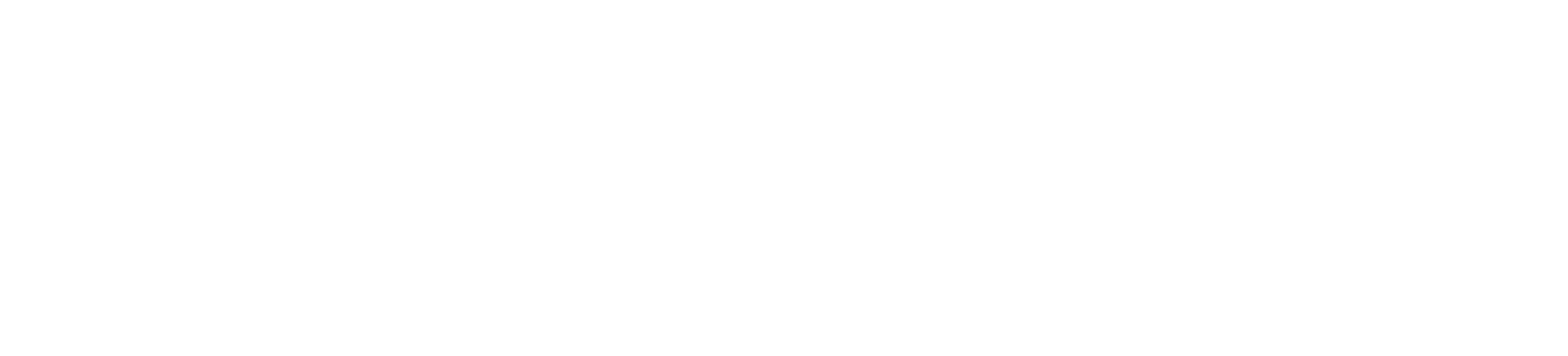
{ CONTEXT }
Was built on top of a third-party LMS (Docebo).
Had a fragmented information architecture.
Was not designed mobile-first.
Had limited flexibility for iteration and experimentation.
Offered no AI support.
Understanding
real user behavior
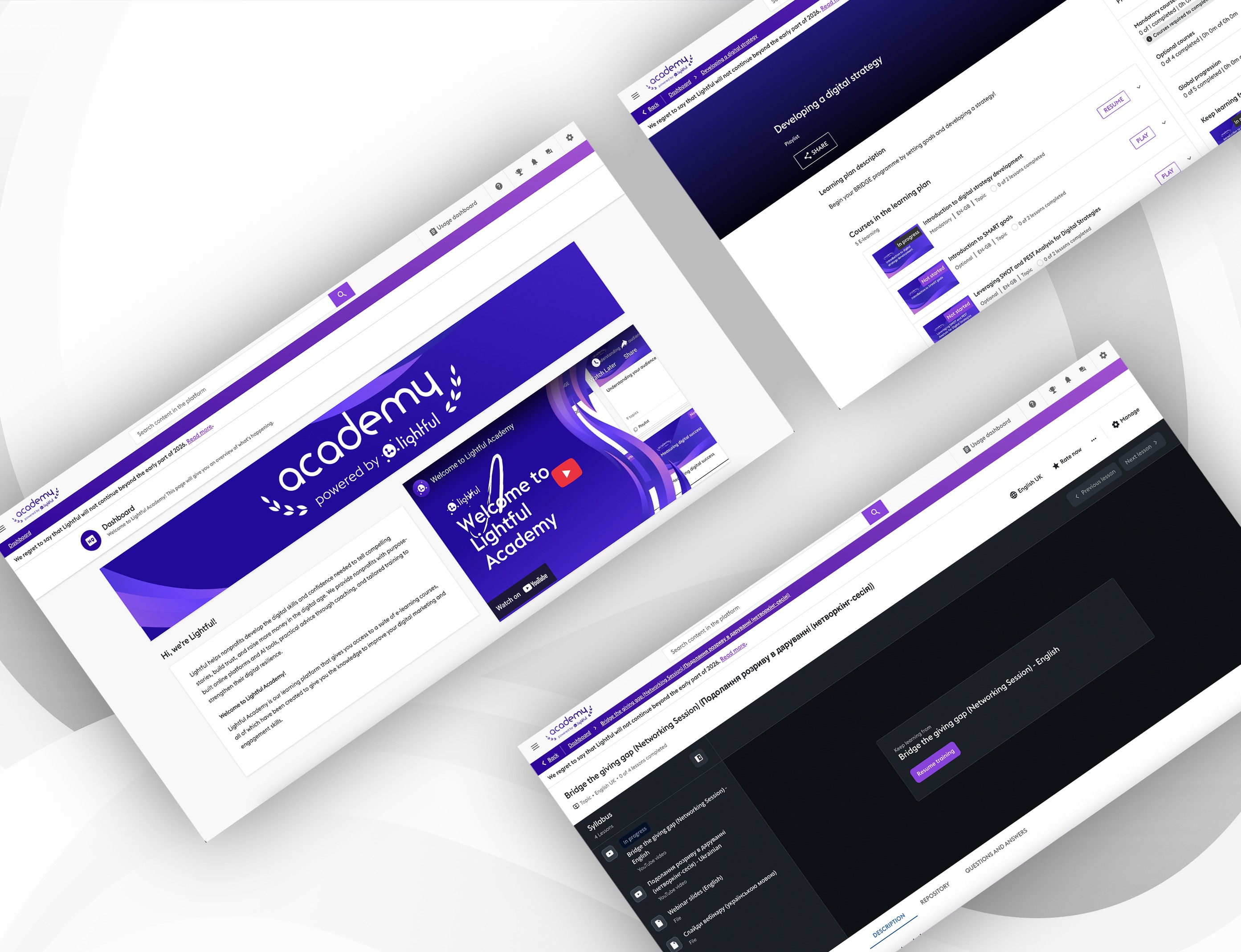
We analyzed platform analytics and discovered a critical insight:
almost 90% of our users were accessing and learning on mobile.
This was a turning point.
The platform had been designed desktop-first, but users were learning on the go, between meetings, on trains, or in short sessions.
This insight directly reshaped our strategy.
We made two core strategic decisions:
1. Mobile-first, not responsive
Not adapting desktop layouts but designing for mobile as the primary experience.
2. Owning the platform
We decided to design our own learning platform instead of continuing to adapt Docebo.
From chaos to clarity
We restructured the system into:
Home (focus & guidance)
My Learning / My Journey
Courses
Live & Coaching
Resources
We built interactive prototypes to test:
1- Navigation clarity
2- Mobile usability
3- Content discoverability
We tested with existing learners and internal coaches.
Users described the experience as “clearer” and “less stressful”
Mobile usage felt natural rather than compromised.
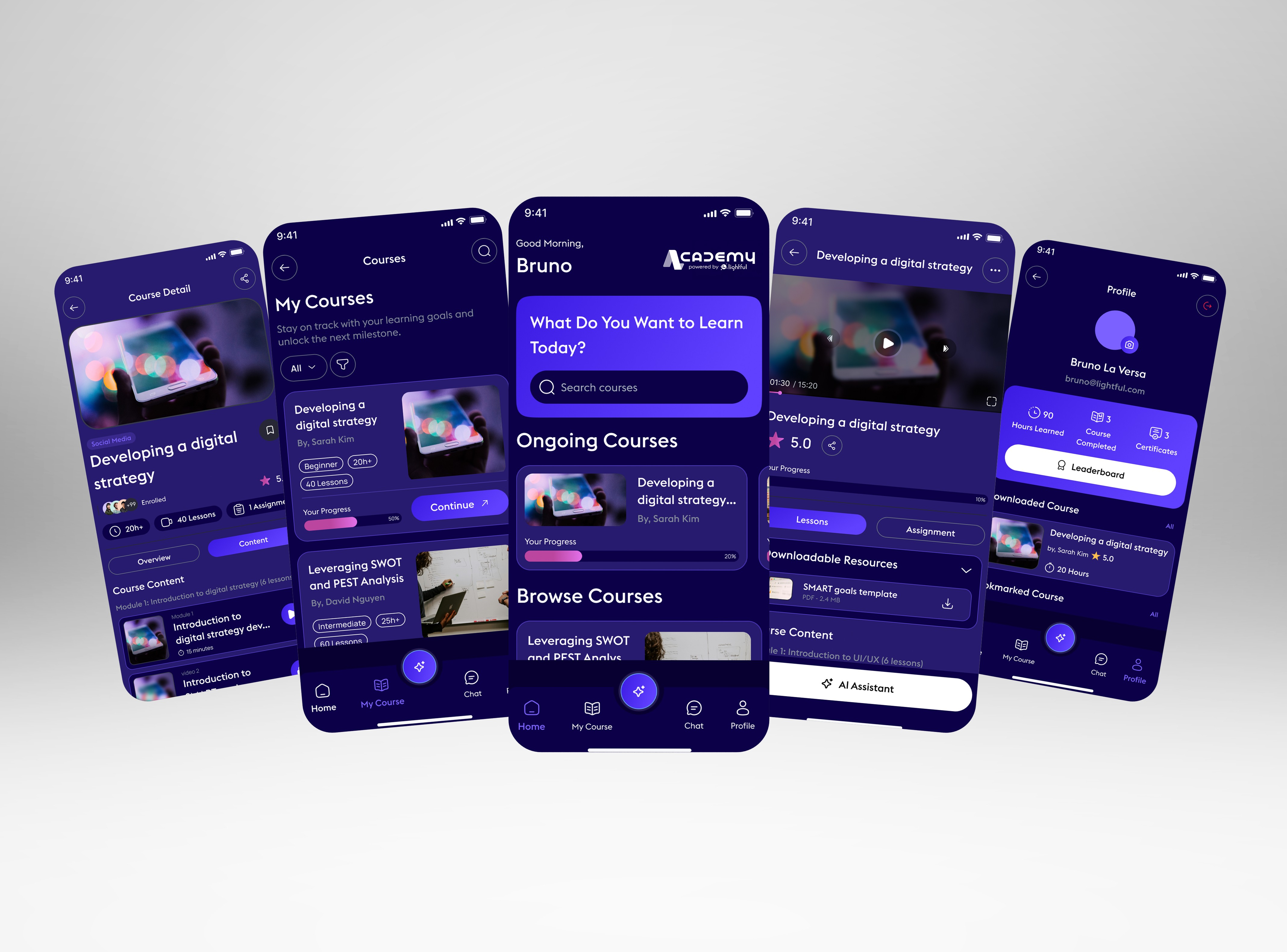
AI as a learning companion
We didn’t want AI to feel like a tool or a feature.
We imagined AI as:
A coach
A guide
A supportive presence
Early concepts included:
AI summaries of lessons and live sessions
Contextual help while watching videos
Reflections after completing content
Suggestions on what to learn next, based on progress
{ PRODUCT DEPTH }
How we measured success
Adoption of the new experience.
Qualitative feedback from users and coaches.
Reduced confusion around where to start.
Users felt more confident navigating the academy.
The experience finally matched the quality of the content.